A New Look for Gage
A new home, a new brand
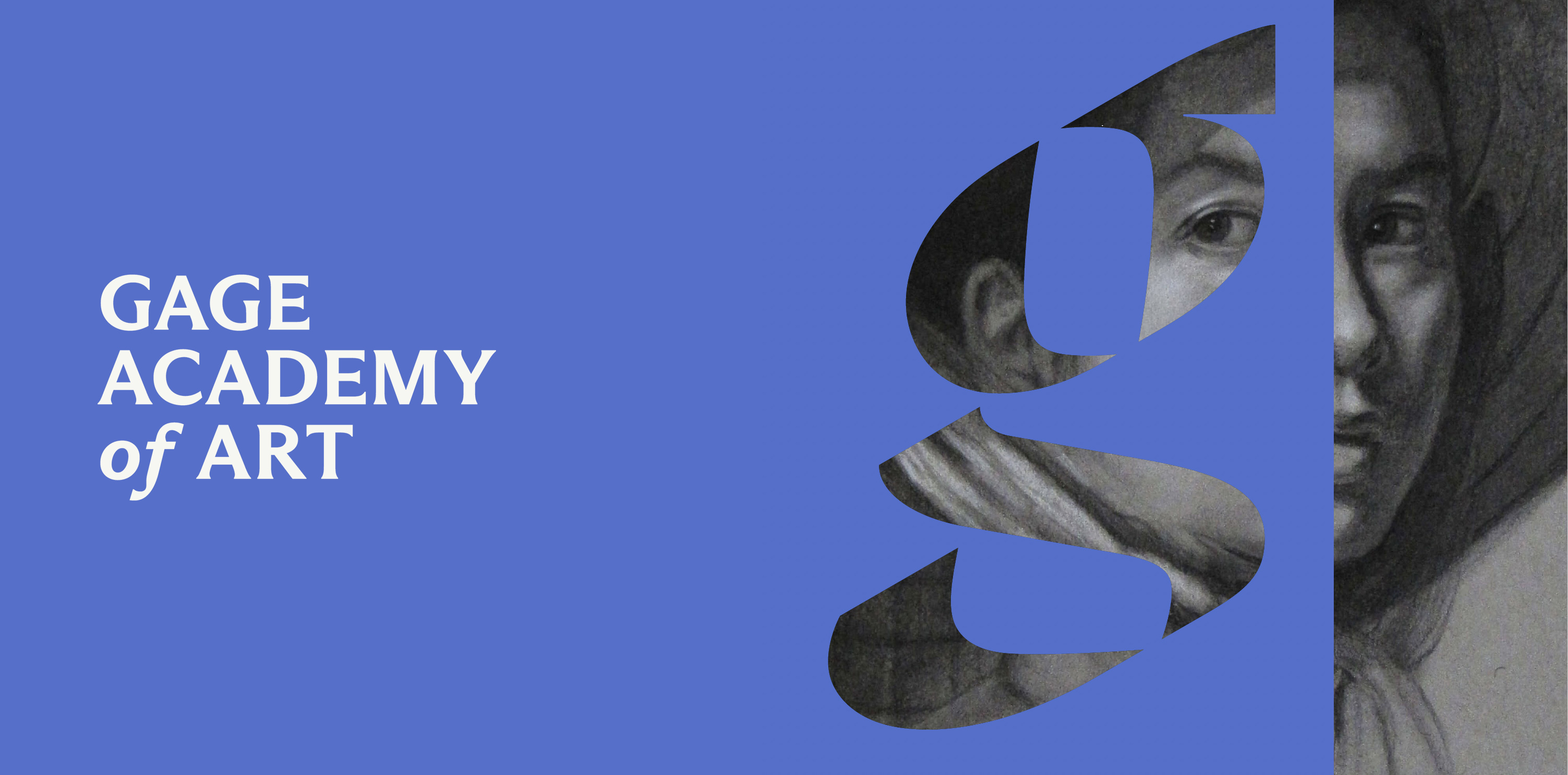
Aligned with the move to our new home in South Lake Union, we are pleased to also unveil a new graphic identity for Gage Academy of Art. We worked with branding firm Awful Good to create a new logo and look for Gage which both honors our history and positions us for our exciting next chapter.
Honoring our legacy
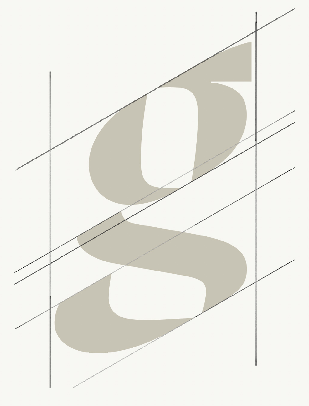
Building on our beloved lowercase "g", the new design is a clean, modern interpretation, while still recognizably Gage.
Its construction and italic nature carries forward the history and legacy of the Gage identity.
Logo as a vessel
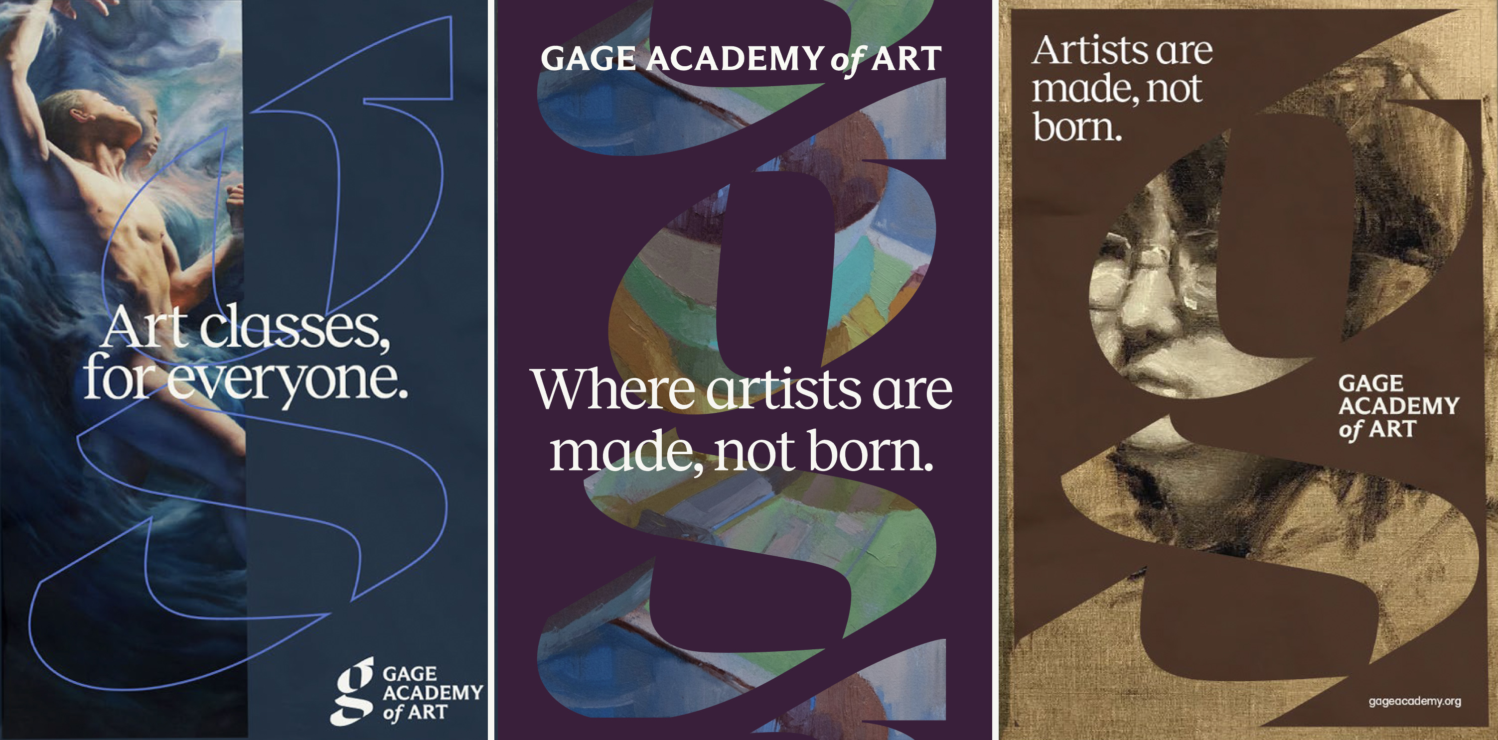
Our icon acts as a vessel, uniquely drawn to hold artwork created by Gage's students and faculty--a unifying window that reveals the full scope of Gage and our artists' work.
By playing with the relationship of positive and negative space, we represent the many contrasting dualities inherent in our institution: we are both traditional and innovative, regimented and experimental, of one lens and multiple perspectives.
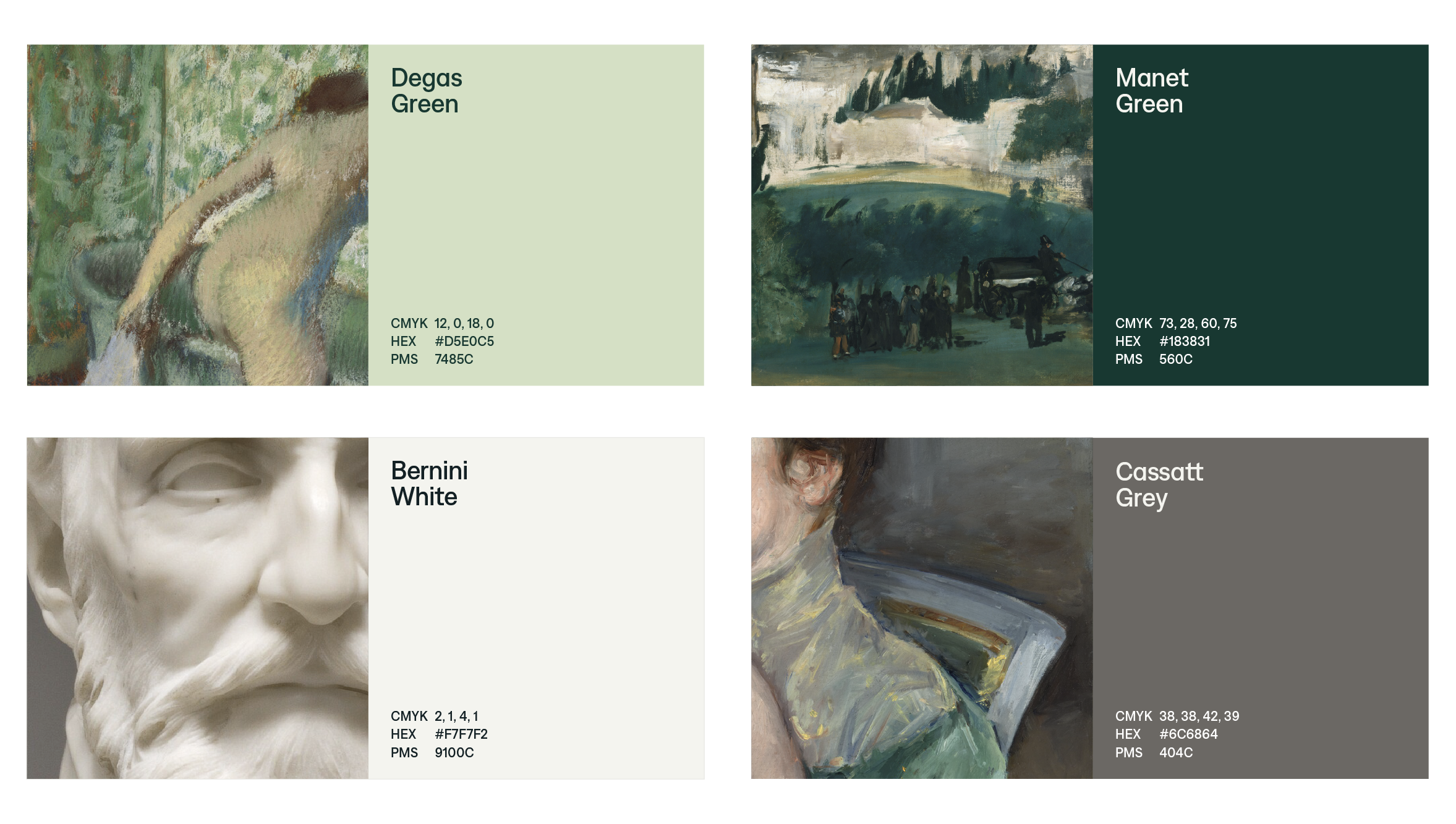
Colors inspired by artists
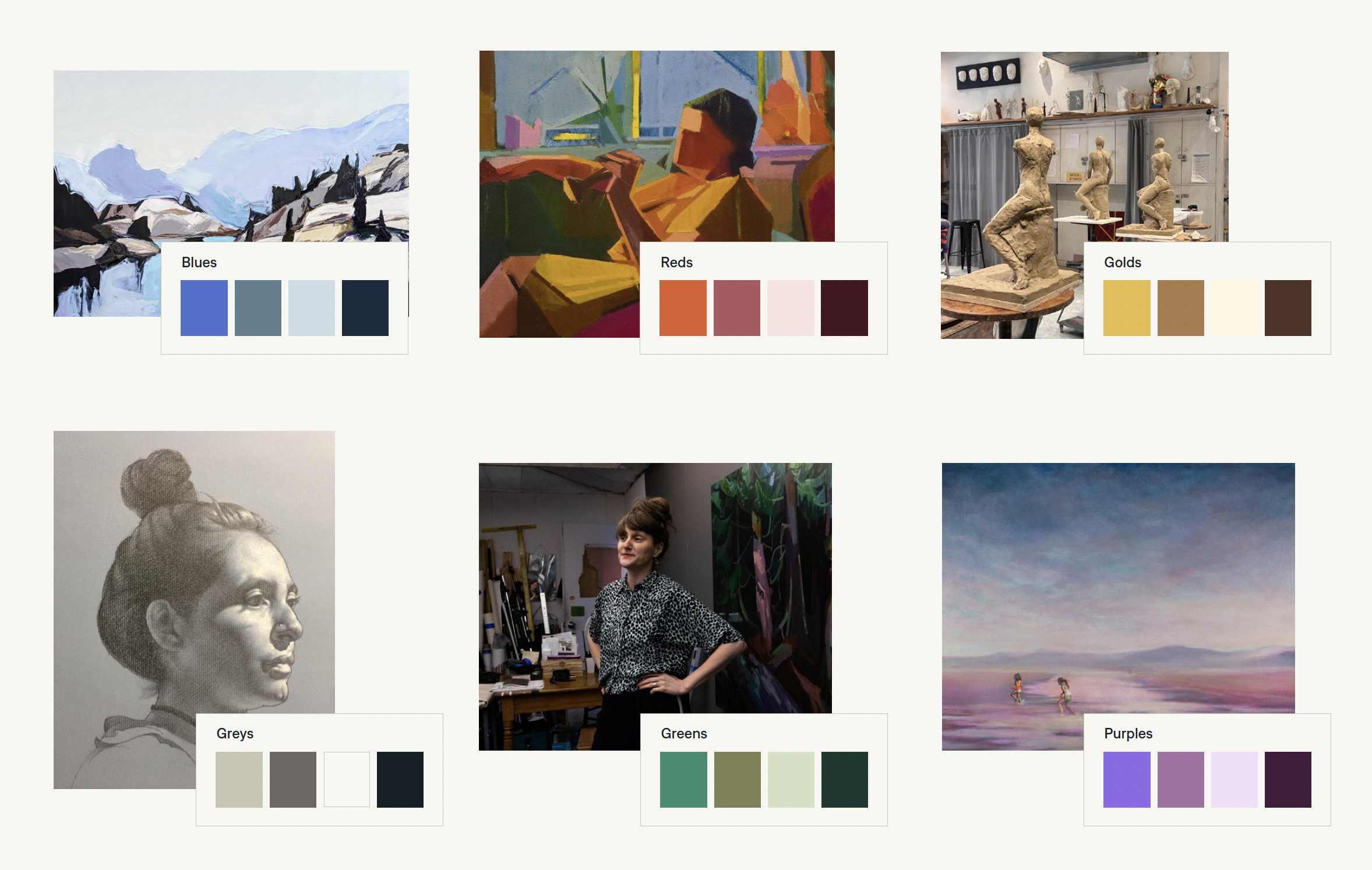
Color plays a crucial role in our identity. It reflects the endless variety of palettes created by the artists of Gage—from deep and moody, to bright and colorful. Each color is named after a master artist, both past and current-day, in recognition of a work that predominantly features that color.
Notably, Gage now embraces a curated library of color stories, moving away from a single primary brand color.
